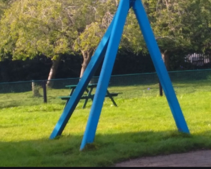
A |

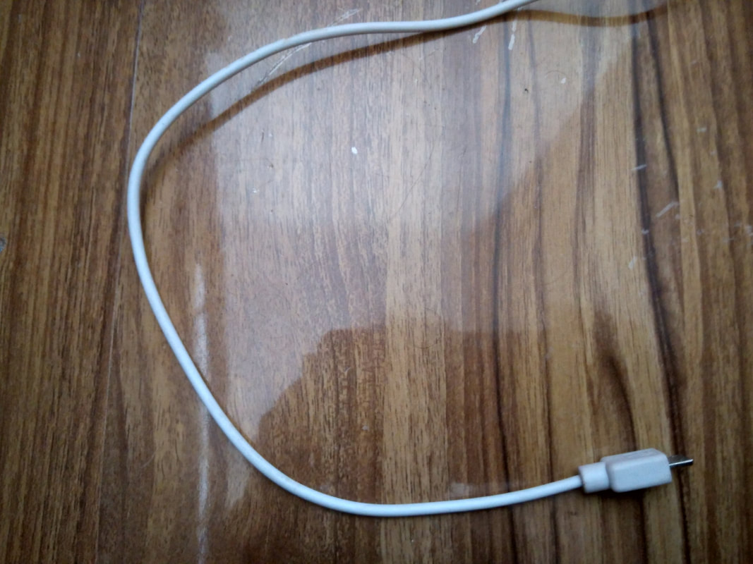
B |
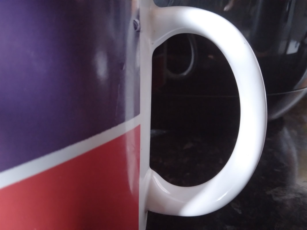
C |
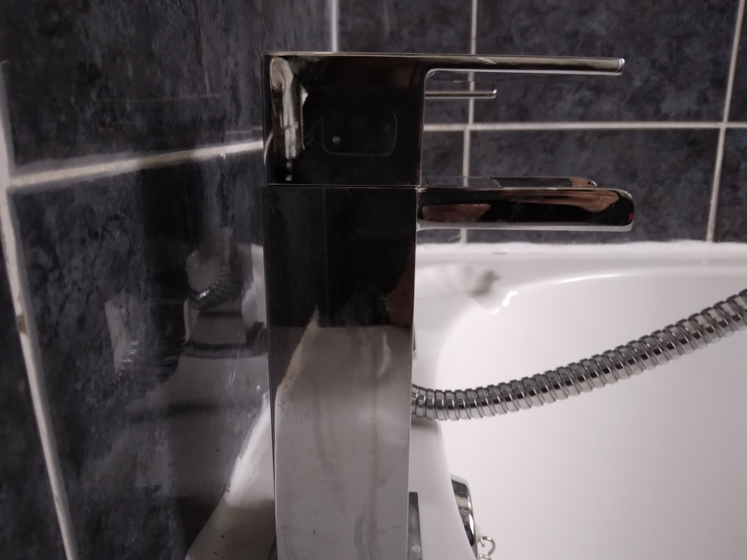
D |

E |
F |
G |

H |

I |
J |
K |

L |
M
P
S
V |
N
Q
T
W |

O
R
U
Y |

X |

Z |
BEST IMAGE

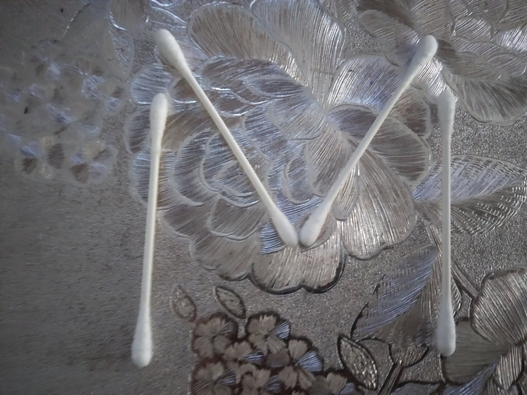
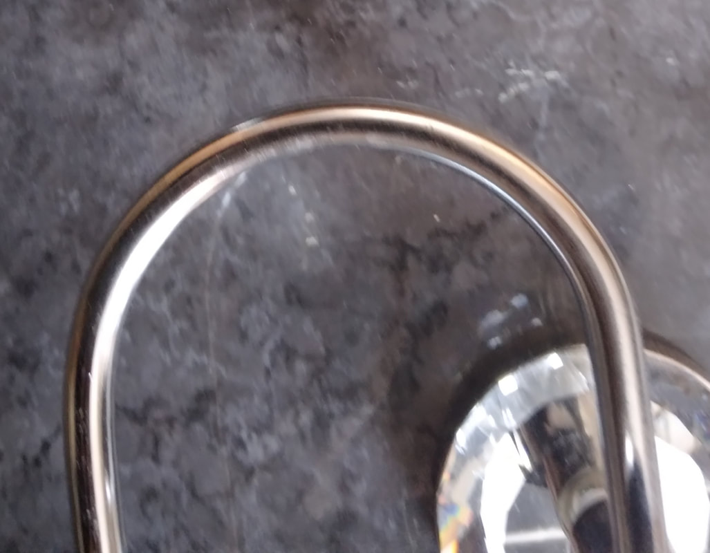
In my opinion, my best image is this photo of a letter V, i personally really like this image as the background is pitch black. The colour on the V really stands out so much more because of this. For this letter, i used the end part of a shiny mirror. For the settings, i changed the ISO and WB on my phone, i set the ISO to 200 because the image turned really dark and i really liked that so i kept it like that and then for the WB i set it to a really high setting and that just made the picture more vivid. I honestly liked experimenting with different settings and that was probably the funnest part for me. After i used these settings the tint of the black and pick just stood out so much to me and i found this extraordinary. The positioning on this image was a little bit difficult even though it doesn't look it, it was because i had to hold the mirror up and try to get the image up and still, which was hard because it kept moving in my hands. However, the more i look at it the more i like how it was done because even though it was hard, the end reveal is what matters and i love it. The V in centred right in the middle with both sides next to it equal which i find amusing. The whole image is well balanced now and when i look about this the first thing that my eyes look at is the V because its so clear and its up to eye-level which means you're naturally drawn into it. In my opinion, the colours i have used just go so well with one another as I'm a fan of black and pink colours, the image just in general pop's out and its quite unique. SO, overall this has to be my favourite picture as when I'm looking at all the Alphabet photos, this is one that stands out the most to me.
WORST IMAGE

In my opinion, i have to admit that this is my worst image ever. Actually, in fact the Alphabet project was just really hard in general for me so with that being said I found that I had a lot of bad pictures that i didn't like, but this was one of the worst in my opinion. This is because i just don't really like how the letter B looks. I forgot to use different lighting's so I'm really mad about that as I know that this image could have been SO much better if i just used a different lighting's in the background as i did with the letter V, there could have been so much more going on in this image. However, since i did not do that the image is just so plain and boring and not fun at all to look at. In my opinion, I think that the subject ion this image doesn't stand out as much as i wanted it to. Like, if i positioned it more closer it may have been more eye-catching but in this case it isn't as it look ordinary like the background. I do think that you can tell what letter i was trying to manifest but it just doesn't look that nice. The image is a little bit dark toned from the letter B which isn't that bad but it seems like the background is lacking so much more variation, which is uninteresting for the viewers attention. IN order to improve, next time I'm gonna do more experimenting with different settings and lights.
SKY


AUTUMN


