STATEMENT OF INTENT
MY THEME
In this project, I aim for a highly developed website of work that demonstrates all of my ideas, creativity and progress. I will do my work around the theme of the 'Texture in the landscape'. I am aiming to go more in depth to showcase my theme of texture by adding multiple layers, simple colours, aesthetic and changing the exposure to very light. I am also wanting to experiment with ISO and use daytime light. At the end of my coursework, I will be picking my best photographs and make annotations on them. I will then present them in my final gallery which will showcase all of my ideas. I want to explore a range of different ideas like geometric shapes in wall panels and circle time lapse. Then I can make a decision on which one I personally think suits both me and my style of work.
FIRST STEPS
The photographer that I want to research is Edward Western, he creates images that are in black and white and he goes in depth and shows all his little details. He contrasts the colours so well with each other that it stands out. and you can tell that he really takes pride in his images because he captures every detail needed and this really stands out to me especially because I love the theme he goes for. The second photographer that I will be attempting the work of is Iwao Yamawaki. I am really excited to attempt his work as it inspires me in so many ways. He uses geometric shapes and adds layers to them which is extravagant for me because the detail stands out and is eye-catching. His work isn't in a wide range of colour, which I like because it doesn't give you a headache and is just peaceful to look at. His work consists of buildings and architecture that are saturated in grey, light fade green with mixes of yellow and orange in there.
INITIAL RESEARCH
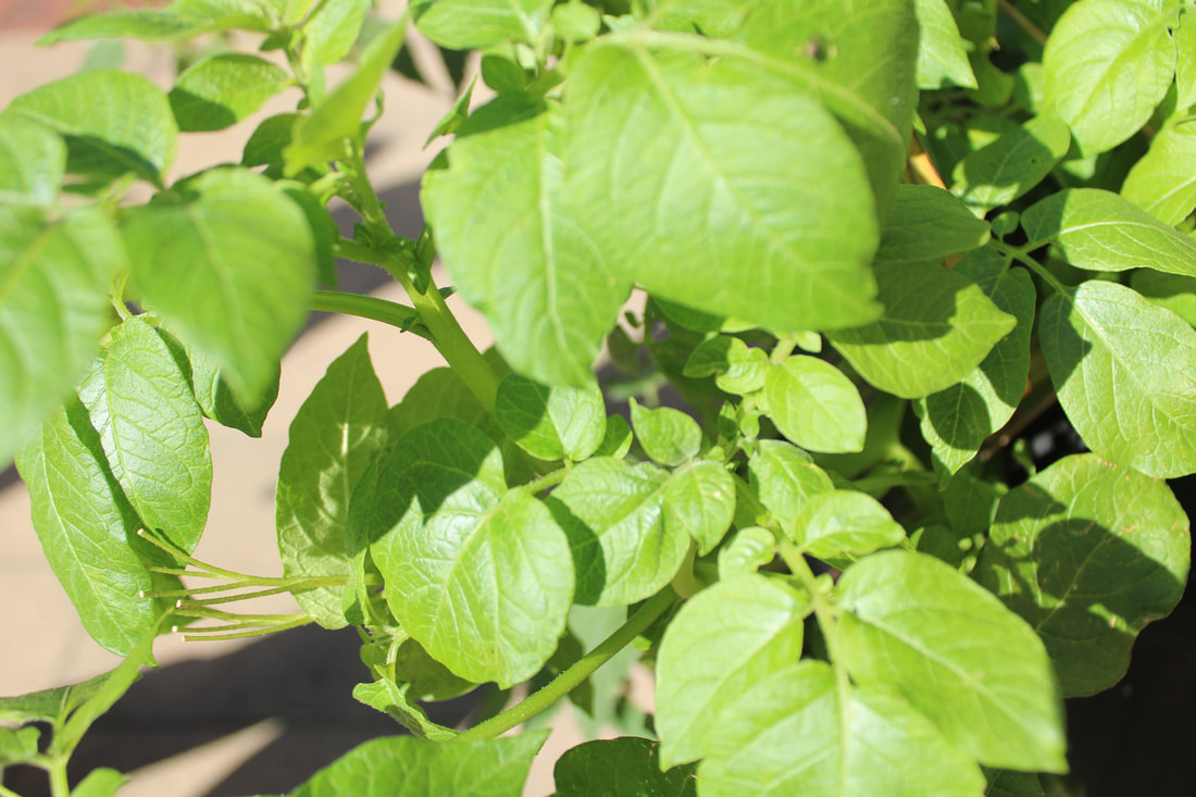
When I chose this theme, my initial thoughts would be to capture natural texture as in fruits and vegetables. This is because in my opinion natural textures like that are so realistic and extravagant. After thinking about my project, more thoroughly. I slowly realized that there are many routes I can take to get that final outcome I want. For example, I have taken many images of man made texture and it is so fascinating. That is definitely another route I wanna take in order to get my theme going. I can combine and contrast both natural and man made together. My aim is to go on more locations and to get more studio shots. If i can get a wide range of texture, then this will allow me to have more images to contrast and experiment with, once I refine my work more in photoshop.
PHOTOSHOOTS I INTEND TO DO
To show progression in my work and theme, I will start by going outside more and taking photos of man made textures such as tires, wood etc.. After completing this activity, I intend to take more pictures of fruits. I will then develop these images further, by taking more ideas from them and editing them in photoshop. In my opinion, going around Manchester to Stretford etc. Is gonna impact my photography work and develop it in so many ways. I plan to gather Texture images from the environment around me. I am propelled in the right direction, as I have a range of ideas that can keep me entertained in my photography Texture journey.
EXPERIMENTS
I personally would like to experiment with a wide range of techniques within my work. When I'm outside school, I intend to use my phone camera. However, when capturing texture in school. I will be using the CANON camera. I also intend to just experiment with using different mobile devices to showcase ,my theme as all devices have their own impacts. I will try to push myself further with photoshop, image adjustment, exposure, temperature ,colour saturation and contrast. I also plan to make a range of patterns.
PROGRESS
I have 3 months to produce my website of work towards the final production of my end work. I aim to complete my initial research within the couple of weeks I have. Then, I will have some time to capture more photography images that showcase my theme. In doing so, this will show progression throughout my work. I will then continue to develop more work in photoshop and to be prepared to go out again with my camera to capture new images that could possibly enhance my work. When I have finally completed my photography outcomes, only then will I display them in my final outcomes.
WHAT I HOPE TO LEARN AND FINAL GALLERY
As my project progresses, I will use annotations throughout my web-page. Labelling my ideas and development clearly. This will also help, in the future for me and other people to find my work easily. I hope to learn more about photoshop at the end of my journey. I also intend for my final outcomes to look extraordinary and well put. I do not want my work to look rushed or in complete. The only thing left to do is to develop more ideas in photoshop and to display my final outcomes. In doing so, I will take more photos of natural and ,man mad texture to help me in the processing conclusion, I aim for a highly developed piece of photography work that showcases all my ideas. I intend to captivate and engage my audience with my final outcomes.
First shoot plan
Moodboard


RESEARCH
EDWARD WESTERN

Context-
Edward western began taking photography in 1902.
He carefully composed, sharply focused his images of natural forms, landscapes, and nudes. Edward liked smooth surfaces as he found that there is much more tone and texture. He liked a more modernist style where his photos were based off the contrast of black and white. One of his images which was the cabbage really showed his interest in the physical textures of vegetables, seashells and other objects. Edward used a graflex camera for all his portraits. This was because the camera made images that excel in depth of field control and image detail. His explained that the picture of the cabbage was because in the cabbage he "sense the entire secret of life's force.” His early influence was Margrethe Mather.
people have said that Edward is-
"one of the most innovative and influential American Photographers"
( I have researched all this information on Edward myself, using google to help.)
COMPOSITION-
This is a photo created by Edward Western and its a photo of a cabbage.
first of all, one of the things that I first noticed was that the picture is all in black and white and I personally think that these two colors really contrast well with one-other. In my opinion, I think that the black was used really well because in a lot of photography pictures, there's normally a lot of color and vibrancy. However, Edward Western has used a dark theme and setting which look really good and it just changes up the whole photo. This image is also a still life image as you can still see it depicts an inanimate object. The image is not photoshopped at all and was taken by a film camera. The photographer has used rule of thirds because the cabbage is perfectly centered in the middle which is eye-catching, However, the top of the vein site on the top third of the photo grid, which is called 'the sweet spot' and this makes your eye get drawn to this place on the image. Now lets talk about the texture of this image, something that I saw in this image that drew my attention right into it and that's the HD quality of this image. This image is also monochromatic which I personally really like because there isn't much going on and the picture is steady and still which just draws your attention in. Another thing, I noticed was that He has used an infinite curve to try and test different lightings. If we really concentrate on this image then we can see that there is a shadowing light on the right top corner of the cabbage which is called a hotspot and is done to see all the details. The views of the cabbage straight away pop out and shows so much texture. I also noticed that there's a sudden light in the image that is on the right side of the cabbage, this may indicate that this photo was actually a studio shot. There's also a key line of focus because the top of the image looks a little blurry but then the bottom is interesting because the texture is so clear. The light also highlights the veins and shows more shadows and textures. Furthermore, there's also leading lines that are curved and adds interest on composition. Now, lets describe the background of this image because I think its really nice and extraordinary. There is a pitch black background which makes the cabbage stand out way more and nothing else is distracting in the image. In my opinion he may have used an infinite curve and I think only light is used in this image because there's only one kind of light that is directed towards the right side of the photo and also another key thing is that as the cabbage is looking down the camera is stood on a tripod or a stand as it'll be easier to get a still image and I think the photographer has used a shutter speed change. The cabbage is picture-plain and is tightly cropped which adds a shadow depth of field. Last but not least, This photographer has used leading lines in this photo of a cabbage and leading lines are very important for photography because it focus on the key subject of the image and positions it well.
first of all, one of the things that I first noticed was that the picture is all in black and white and I personally think that these two colors really contrast well with one-other. In my opinion, I think that the black was used really well because in a lot of photography pictures, there's normally a lot of color and vibrancy. However, Edward Western has used a dark theme and setting which look really good and it just changes up the whole photo. This image is also a still life image as you can still see it depicts an inanimate object. The image is not photoshopped at all and was taken by a film camera. The photographer has used rule of thirds because the cabbage is perfectly centered in the middle which is eye-catching, However, the top of the vein site on the top third of the photo grid, which is called 'the sweet spot' and this makes your eye get drawn to this place on the image. Now lets talk about the texture of this image, something that I saw in this image that drew my attention right into it and that's the HD quality of this image. This image is also monochromatic which I personally really like because there isn't much going on and the picture is steady and still which just draws your attention in. Another thing, I noticed was that He has used an infinite curve to try and test different lightings. If we really concentrate on this image then we can see that there is a shadowing light on the right top corner of the cabbage which is called a hotspot and is done to see all the details. The views of the cabbage straight away pop out and shows so much texture. I also noticed that there's a sudden light in the image that is on the right side of the cabbage, this may indicate that this photo was actually a studio shot. There's also a key line of focus because the top of the image looks a little blurry but then the bottom is interesting because the texture is so clear. The light also highlights the veins and shows more shadows and textures. Furthermore, there's also leading lines that are curved and adds interest on composition. Now, lets describe the background of this image because I think its really nice and extraordinary. There is a pitch black background which makes the cabbage stand out way more and nothing else is distracting in the image. In my opinion he may have used an infinite curve and I think only light is used in this image because there's only one kind of light that is directed towards the right side of the photo and also another key thing is that as the cabbage is looking down the camera is stood on a tripod or a stand as it'll be easier to get a still image and I think the photographer has used a shutter speed change. The cabbage is picture-plain and is tightly cropped which adds a shadow depth of field. Last but not least, This photographer has used leading lines in this photo of a cabbage and leading lines are very important for photography because it focus on the key subject of the image and positions it well.
Connections-
In my opinion, I really think that This cabbage photo is significant because even though this is a picture of a cabbage which is literally such a simple object but yet its crazy how many inferences and connections we can make from this one vegetable. In class, we are studying texture and have already studied fruits and vegetables so this image is really relevant because the texture on the cabbage is insane, how the veins instantly pop out, I love it.
We can connect this image to gardening or cooking because if you think about it, cabbage is a common food used for cooking so we can connect it to that or gardening because Edward could have just grown some cabbages in his back garden and thought it would look really good as a image. Edward, has used leading lines to make the image up to eye-level and also a light concentration which stands out a lot. In my opinion, I want to start experimenting with my pictures, Edward has inspired me as a photographer to use different settings and different methods when it comes to taking photos. Edward was known for his outstanding angles so In the future I wish to improve and start exploring different angles that work for me best.
We can connect this image to gardening or cooking because if you think about it, cabbage is a common food used for cooking so we can connect it to that or gardening because Edward could have just grown some cabbages in his back garden and thought it would look really good as a image. Edward, has used leading lines to make the image up to eye-level and also a light concentration which stands out a lot. In my opinion, I want to start experimenting with my pictures, Edward has inspired me as a photographer to use different settings and different methods when it comes to taking photos. Edward was known for his outstanding angles so In the future I wish to improve and start exploring different angles that work for me best.
Comment-
In my opinion, I really look this image because I loved how he experimented and changed the background to black and white which are two colors that contrast so well with one another. so I find this image so inspiring as I wish to do the same thing that Edward has done. I wanna improve my pictures and make them more eye-level and more unique. I personally want to do photos of objects that have a bigger deeper meaning to them which I personally think that the meaning of this cabbage is just to be realistic and when I look at it, one word comes to mind and that is LIFE. It's hard to explain but that's just what I think of when I look at this image. and I think that Edward has took a image of something so simple but the turn-out of it is so beautiful and exquisite because it might just be a cabbage but I personally think that in my opinion there is a much bigger meaning o this photo and the way the photo is angled is perfect and eye-catching.
RESEARCH
IWAO YAMAWAKI

CONTEXT-
Iwao Yamawaki was a Japanese photographer who taught photography in japan for 6 months. He also had a strong interest in architectural photography and took many photographs of the exterior and interior of the famous Bauhaus Dessau building complex, as well as of buildings in Berlin, Amsterdam and Moscow. He enjoyed experimenting from unfamiliar perspectives and angles, close-up details, use of light and shadow, and experimentation with multiple exposure. He exhibited some of his work, but was dissatisfied with the Japanese photographic scene and gave up photography altogether.
His photographs are strongly influenced by the Neues Sehen (New Vision)
( All this context has been researched carefully by myself through google )
His photographs are strongly influenced by the Neues Sehen (New Vision)
( All this context has been researched carefully by myself through google )
COMPOSITION-
This is one of the photographs taken by the Japanese photographer Iwao Yamawaki.
Iwao, was always keen in taking architectual photographs. Firstly, one thing I noticed was that Iwao always keep his photos in a certain colour. Although, it may look quite bland for some people. It has random shades of colour that all oddly match. The colours are blended in with one another so nothing stands out, more than the other. In my opinion, this romanticises the image. Personally, I think the settings, exposure and use of colours just contrast so well with one another and matches the natural architectual image that Iwao was looking for. This image, was not photoshopped at all. It looks like the buildings are corresponding with each other and are leaning down. Iwao was an old photographer and actually started taking photos of buildings etc at an earlier time. With this in mind, the photographs taken back then were not clear at all as they didn't have the options to use a good quality camera. However, putting all this aside. I still believe that the photo is eye-catching itself and stands out. It is centered in a unique way and lets us as an audience see the image for what it really is. It also stood out to me that this photographer could have used an infinity curve, given that the lighting on this image isn't natural. The exposure has definately been tested beforehand as Iwao has set it really light. The saturation has also changed given the fact that the image is almost yellow and grey. In my opinion, I personally like how the image is steady and it is a really calm setting. I also love the fact that everything in this picture is quite simple but also mesmerising in its own way. The background of the image, is same contrasting colours as the actual building itself. However, I noticed that there was also a natural light surfacing the background. Overall, there isn't much you can say about this image. Apart from the fact, that the image itself is quite smooth and rejuvenating. Even though, the image is simple. It has its own style which makes it stand out so much more.
Iwao, was always keen in taking architectual photographs. Firstly, one thing I noticed was that Iwao always keep his photos in a certain colour. Although, it may look quite bland for some people. It has random shades of colour that all oddly match. The colours are blended in with one another so nothing stands out, more than the other. In my opinion, this romanticises the image. Personally, I think the settings, exposure and use of colours just contrast so well with one another and matches the natural architectual image that Iwao was looking for. This image, was not photoshopped at all. It looks like the buildings are corresponding with each other and are leaning down. Iwao was an old photographer and actually started taking photos of buildings etc at an earlier time. With this in mind, the photographs taken back then were not clear at all as they didn't have the options to use a good quality camera. However, putting all this aside. I still believe that the photo is eye-catching itself and stands out. It is centered in a unique way and lets us as an audience see the image for what it really is. It also stood out to me that this photographer could have used an infinity curve, given that the lighting on this image isn't natural. The exposure has definately been tested beforehand as Iwao has set it really light. The saturation has also changed given the fact that the image is almost yellow and grey. In my opinion, I personally like how the image is steady and it is a really calm setting. I also love the fact that everything in this picture is quite simple but also mesmerising in its own way. The background of the image, is same contrasting colours as the actual building itself. However, I noticed that there was also a natural light surfacing the background. Overall, there isn't much you can say about this image. Apart from the fact, that the image itself is quite smooth and rejuvenating. Even though, the image is simple. It has its own style which makes it stand out so much more.
CONNECTIONS-
In my opinion, I think this image that Iwao Yamawaki has created is significant. This is because, even though its basic, it has its own flaws to it. In class, we have been studying texture. This relates to Texture because although its blurry. The image itself is of a building which is architecture and us as a class ourselves have looked into architecture and taken many photos of buildings,skyscrapers etc. We, can connect this photo to travelling. This is because, when your'e travelling the amount of new,tall buildings and places you see is magnificant. Even, in day to day life we see so many architectual things on a regular. Iwao, himself liked travelling. We can infer he has visited many places to take these beautiful photographs of his hometown. Personally, me as a photographer. I think that Iwao Yamawaki's photography has really inspired me to improve and work harder on my photographs. This is because, Iwao is keen on taking better angles that leave a impact on them and he also perfectly contrasted and saturated his images. This inspires me, in the future to magpie Iwao's work and use them as guidance to make highly developed peices of work.
COMMENT-
In my opinion, I find this image satisfying to look at. This is because the contrasting colours that have been deliberately used to make an impact on the photo. The yellow saturated effect this image has is extraordinary. I wanna take inspiration from Iwao's work because his work is simple but elegant. He makes something that is ordinary look fascinating. In the future, I intend to do the same by keeping my photographs up to eye level and to use a variety of colours. Overall, the angle is just eye-catching and you can really tell that Iwao Yamawaki enjoyed taking photgraphs of buildings. This is because, the style of artwork doesn't seem new to me but esquiste.
Natural Texture
To begin my texture projects I have set up a studio shoot and have used plain white and black paper I am going to focus on the details and texture of fruit and vegetables as a starting point.


|

|

|


|


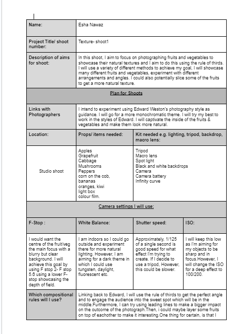
This was from shoot 1- my first ever photography attempt.
We took photographs of fruits & vegetables and tried to get a natural texture with a line of focus in the middle of the object. We also experimented with different lightings like daylight etc. I personally changed the ISO as I thought it made a bigger impact on the image.
We took photographs of fruits & vegetables and tried to get a natural texture with a line of focus in the middle of the object. We also experimented with different lightings like daylight etc. I personally changed the ISO as I thought it made a bigger impact on the image.
Editing progress


BEFORE |
AFTER |
|
|
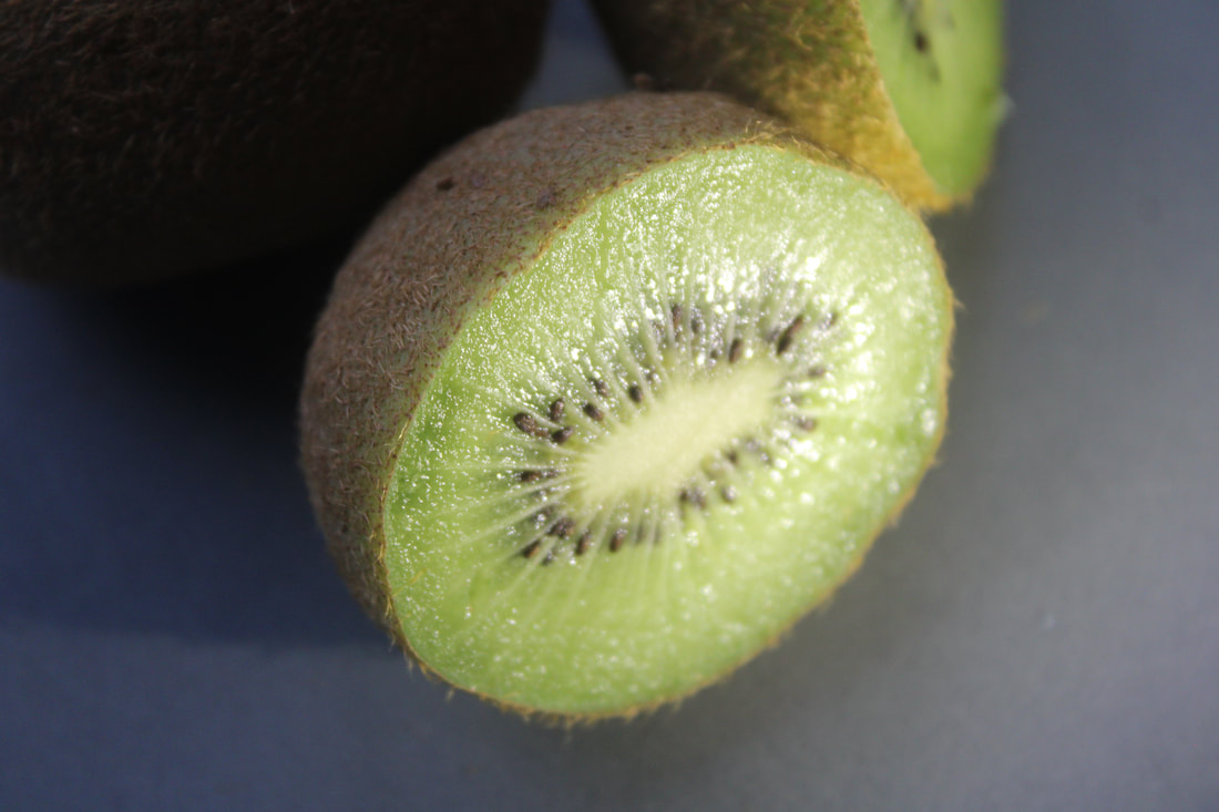
This was my first ever time trying photoshop. I was experimenting with the exposure and I really liked how the kiwi looked after changing the saturation. I went to great lengths to get the exposure right. In my opinion, it brought the image more to life and adapted it.


BEST |
WORST |
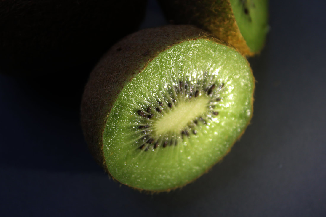
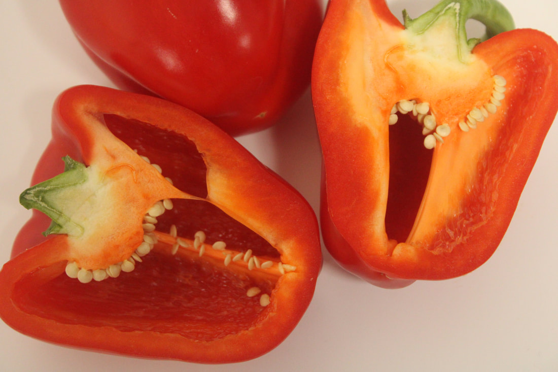
In my opinion, this is my definitely my favorite image of the red pepper because the exposure is fitting right and matches the look I was going for, dim and dark. This image is captivated in the middle and has a light line of focus as its centered right in the Centre. I personally think that this image gets you engaged with what's going on and draws you in the subject matter. In my opinion, this image is intriguing and well balanced. . The ISO has resulted in a clear and crisp image that's filled with entertainment. I don't think, that this image is noisy or anything and it all is quite even and fair.
|
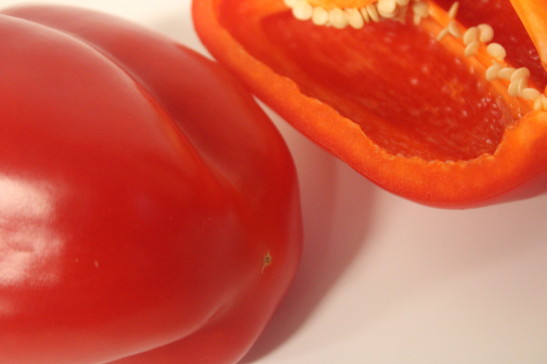
In my opinion, this has to be my worst photo because the light is directed in the right hand side corner top of the image which isn't really Asymmetrical and the image is over exposed. There isn't a line of focus, although the image is quite clear, its just not angled that professionally, so its not a pleasing composition. To improve it, I could have had the other side of the pepper showing. There can be a more shallow depth of field, but there isn't which can make this image seem so boring and just not that engaging at all. When, I look at this image I see that there's not enough going on and your eyes aren't drawn to anything because there's nothing in the center to lookout for and its kind of confusing for us as viewers looking at this image. The exposure isn't enough and the light just invades the whole image.
|
MANCHESTER CITY CENTRE
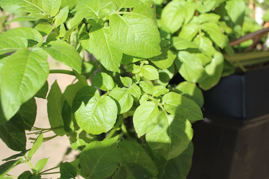
To extend my texture projects I will be going on Location to Manchester, as I am walking around I will be capturing texture as I go. This will allow me to experiment with my camera setting as we will be moving to different areas. Hopefully I will capture images that will help me to show my response to texture.
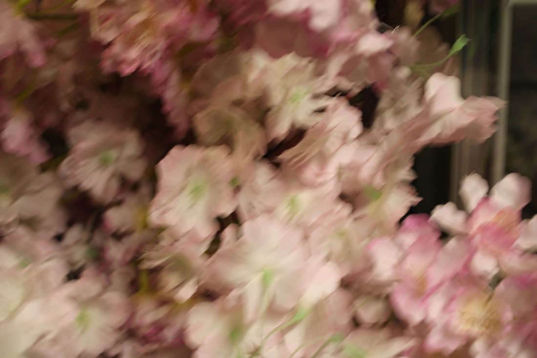
Natural form captured in Manchester


|
|
|


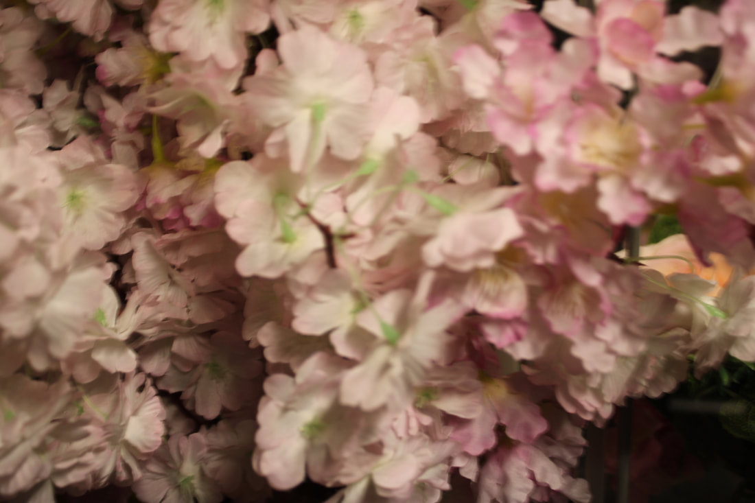
All these images you see here, were taken at Manchester city Centre and I tried to capture natural texture. I intended to showcase a soft, pretty natural aesthetic. With this in mind, I saw some amazingly beautiful flower's that looked stunning. I thought it would be a good idea to captivate my audience with these beautiful flowers. I also captured different sides of the flower's, I took some close up shots, then for some of them I kept distance but zoomed in.
Editing progress


BEFORE |
AFTER |

|

|
This was my first ever photo with photoshop, I went for a monochromatic black and white flower and I think it contrasts well. I experimented with different exposures and contrasts and added multiple Adjustment layers over one another to make the flower more in depth. I tried to link it back to Edward Westerns style as most of his work is in black and white, but as you can see I did go a bit over exposed on it and I make the shadows darker.
Location shoot to Padley Gorge

This was our second photography trip and it was based in the late districts in Padley gorge, it took 1hour and 30mins alone to drive there. In my opinion, the weather and setting was so beautiful because the photographs taken had natural and clear lighting which enhanced my images. However, there were some downsides while I was there. As it was a full day trip, I had to constantly change the settings of the camera as I kept moving around changing views and areas, some spots were lighter than others whereas others were darker so I had to try to even it out. Furthermore, another downside was that taking a photograph of something was more harder as I felt really cold that day and very rushed. For some of my photographs I used sports mode to achieve a better and clearer image, this mode also enabled me to take images that could move. I used the focus lens to get really close up views of multiple things such as moss, trees, flowers etc. Overall, I took a wide range of images, most of them showcasing the theme 'texture'. Also, I used rule of thirds to capture sweet spots and to draw the viewer in instantly to what the object is showing. Finally, I tried capturing photos from different angles and viewpoints of the same object to capture a variety of images showing the different textures.
My FAVOURITE IMAGE

Natural white flowers


red flowers


dandelions


daffodil


Red tree


Moss


close-up moss
Dark shade moss


Moss from the side


light shade moss


blurred moss


moss from distance


green moss


Branches
moss branches


close-up branch


Wood
close-up tree trunk


patterned tree branch


Close-up wood
close-up tree


Blurred water


river/stream
grass covering the stream


close-up river


close-up stream


water close-up shots


orange muddy stream


river/moss


river


Muddy water


Tunnel stream


water and rocks


close-up water fountain


tunnels
bleached out tunnels


distant tunnels


Train track


mud
muddy ground


muddy pathway


bridge


Pathways
clear distant pathway


Wet pathway


Fence


Leafs/branches
Close-up leafs


Location shoot to Manchester looking at Man made texture


These pictures again were taken at Manchester city Centre, it was a beautiful astonishing fountain that really stood out to me. The vibrancy on the colour's that sprung out captivated me. I managed to get amazing shots of the water, some pictures were clear and others not so much. Last but not least, I enjoyed taking these photos and looking back on it, I'm really proud of the photographs taken.
WORST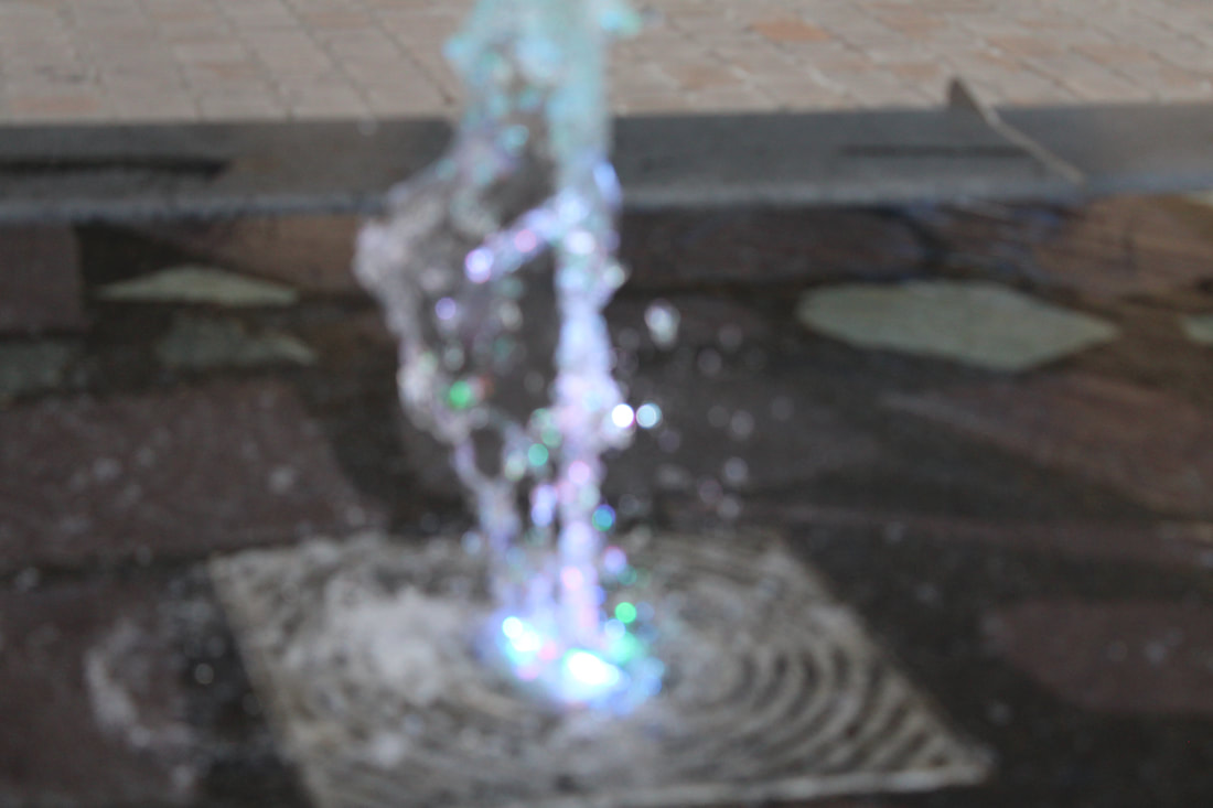
In my opinion, this is the worst image I have ever taken in this shoot.
This image is all blurry and u cant really tell what the subject focus on this is, it is hard to clarify. The whole image is out of focus, I cant even tell the exposure, ISO or WB used in this. The background ambient light doesn't match the picture and the theme I was going for. This image seems in actually fact rushed. |
BEST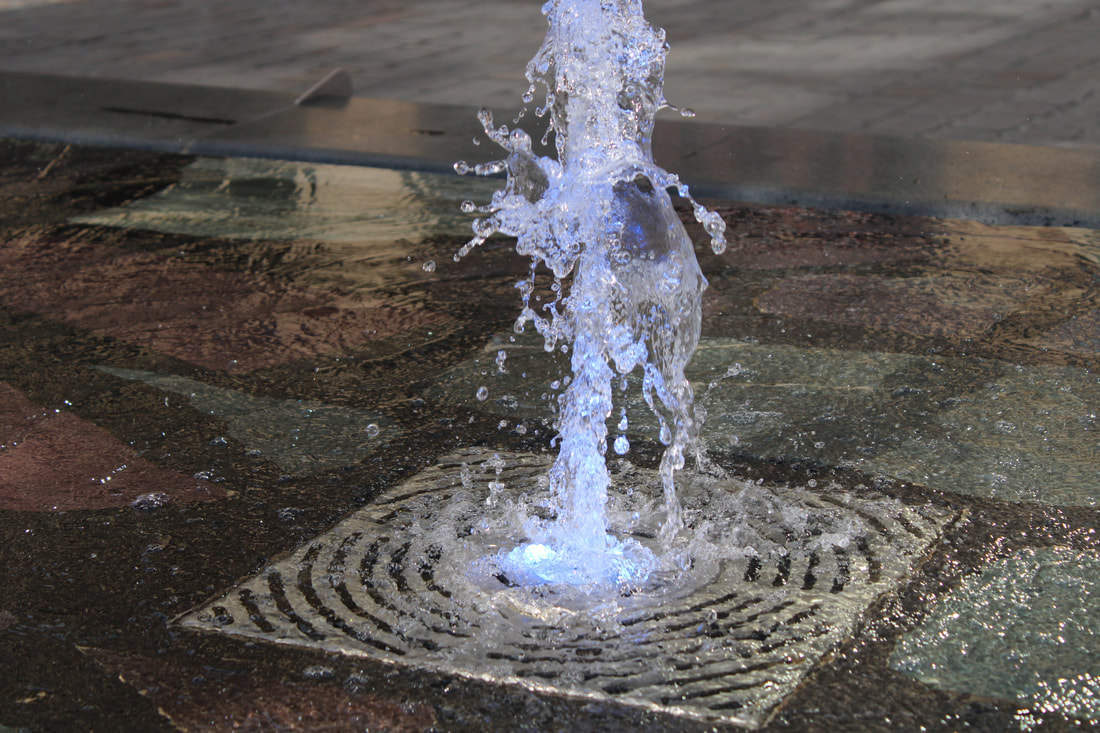
In my opinion, this is the best image I took of the water. This is because, the subject matter is the water and its so in focus and clear that it looks extraordinary good. The waves of the ground water in the background are also in focus which makes this picture even more brilliant but you can also tell what the main subject is. This image is perfectly in the line of focus and right in the middle which is eternally amazing. This is because it draws you in and the ambient light in this picture actually looks decent.
|
Manmade Texture


These photos were taken in the outside yard at school. Surprisingly, there was a lot of man made texture that captured my eye. I tried to get as much texture as I could. Looking back, I definitely could have improved and went for a more unique shot but still I don't dislike these photos and I think I personally tried my best.
BEST |
WORST |

|

|
|
In my opinion, this is my best image from shoot 4. The subject matter is clear and in focused and the background is blurry and you don't focus much on that because the design in this image is so clear and beautiful that it stands out. I took this image which my camera facing portrait because I felt like it would've added so much more and I did because I'm truly amazed which how it came out. I think that I like this image more because its zoomed in on the subject so your eye is naturally drawn in and its not too noisy or anything.
|
In my opinion, this is the worst image taken from shoot 4 of this subject. This is because, I feel like even though this image is still good and in line of the focus. The problem is that there's too much going on so when you look at it, it seems very noisy and there's too many disturbances. I feel like its hard to tell what the subject actually is because its showing too many things at once but also the fact that I did this from a portrait angle but it looks so different to how the other close ups.
|
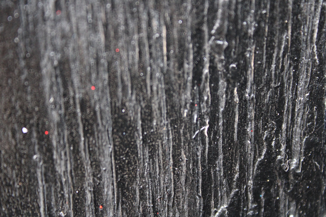
Textures captured on the wall and floor around Manchester


Rust on metal


Textures inside of the Cathedral


These photos were taken in Manchester city centre and I went for a series of man made texture, because there was a lot of extravagant texture that I saw so I was really intrigued with how everything looked. Some of my photos in this series, are pretty blurry and it seemed like I was in a bit of a rush but still I think it turned out great and I'm also a little disappointed because the last image you see here has really nice texture and I didn't get a zoom out shot so I don't actually know what this image is of.
Shadows


Gate


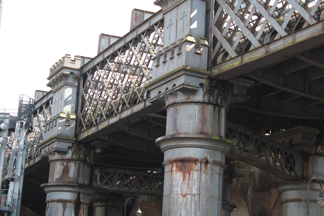
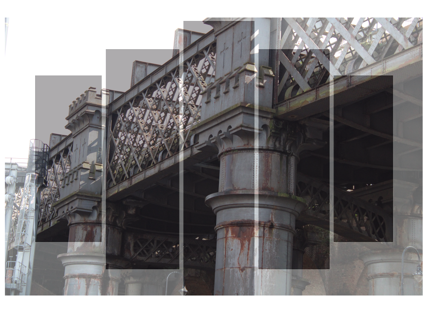
Close ups of the bridge


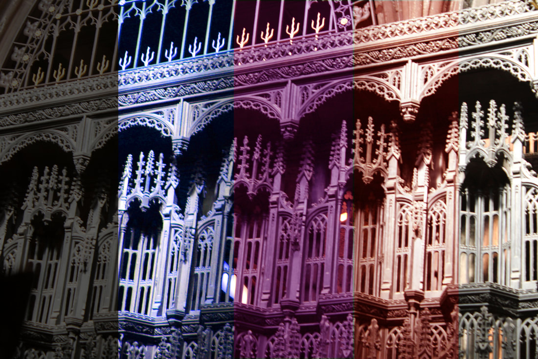
Manchester has lots of bridges and structures when I was taking my images I thought about the photographer Iwao Yamawaki that I had researched and I tried to take inspiration from the work. When looking at the structures, even though his work is buildings I feel this image really works well because of the angle I have captured it from.

|

|


Bridges


Cathedral


BESTIn opinion, this is my best image, because it show's all of the subject matter and if u look close enough you can see that the buildings are very clear whereas some of the sides that are irrelevant are blurry which is want I wanted because it enhances the picture is so many ways. It doesn't look too full but right. The sky makes this image so much more vibrant, in a way you wouldn't expect. The angle is a little bit slanted if u look carefully it kind of looks like the building is falling.
|
WorstIn my opinion, this is the worst image, because even though my Best looks quite similar to this. The difference is that this image is more dark and for some reason it just doesn't look that amusing as the other one. This image shows' more of the side of the building which is unnecessary to me and irrelevant.
|

|

|
Traingle


John Rylands Libaray


Glass buildings in Manchester


Texture from graffiti


Location- Manchester city Centre
I took a wide range of photos of architecture of the fantastic buildings I saw in Manchester city Centre. They were tall and overall I thought they would make really good images so I took many brilliant photos of them. The lighting I used was all-natural because I wanted to keep is as natural as I possibly could.
I took a wide range of photos of architecture of the fantastic buildings I saw in Manchester city Centre. They were tall and overall I thought they would make really good images so I took many brilliant photos of them. The lighting I used was all-natural because I wanted to keep is as natural as I possibly could.
DEVELOPING MY IDEAS


This is the tutorial I used...
My first experiment


These were the few snips I made, after experimenting with my first real experiment which was Time lapse.
BEFORE |
AFTER |

|

|
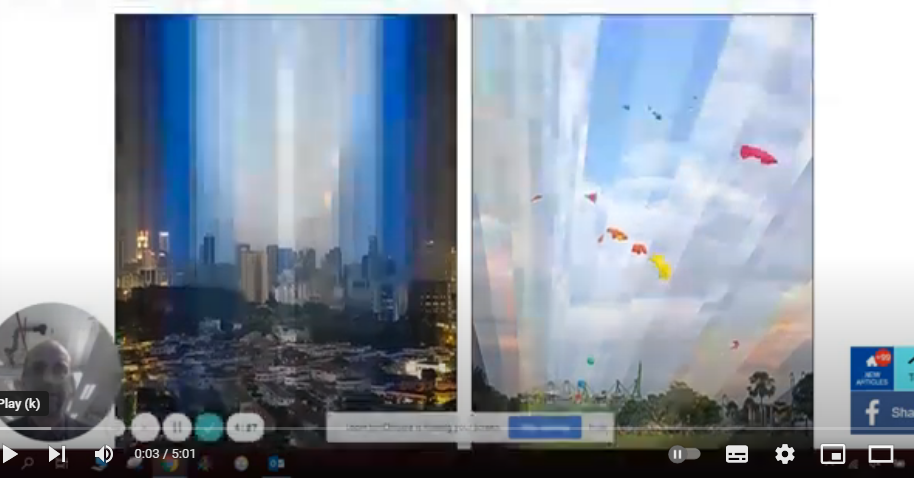
As you can see here, for my first experiment I selected the image of one of the water fountains that I did before. I thought it would be an amazing image to start off with and it did not disappoint, the time lapse was very easy and I had no trouble finishing it. After trying photoshop for the very first time, I learnt a lot of new things that I didn't know before. For example, how to change the saturation, colours, lighting, adding layers etc.
My second experiment


|
BEFORE
|
AFTER
|
|
|
|
For my second experiment, since the last one was quite easy. I attempted something else and went for colour stripes. It was also the form of time lapse, just different shapes. It was honestly the easiest thing ever and I definitely thought to myself that I should try something more challenging that tests me. Since this was my second attempt off trying photoshop, I experimented with more tools and used a variety of different colours.
My third experiment


BEFORE |
AFTER |
|
|
After the first and second experiment, I felt like I had to make something a bit more challenging, but if I'm being honest it wasn't at all. It was the same style as the second experiment. However, this time I added more of a variety of different and that's all.
My fourth experiment


BEFORE |
AFTER |
|
|
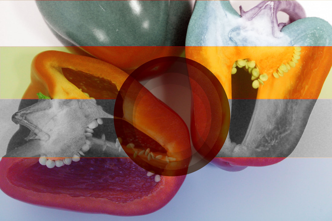
In this experiment, I included both time lapse together and formed it in a unique way as the circle time lapse overlaps the rectangle one. First, I used different colours but then realized that it would be more impactful if I made some areas black and white and also monochromatic. This idea really blew me off, because it ended up working really well and I liked the end result as it looked more 3D.
My fifth experiment


BEFORE |
AFTER |
|
|

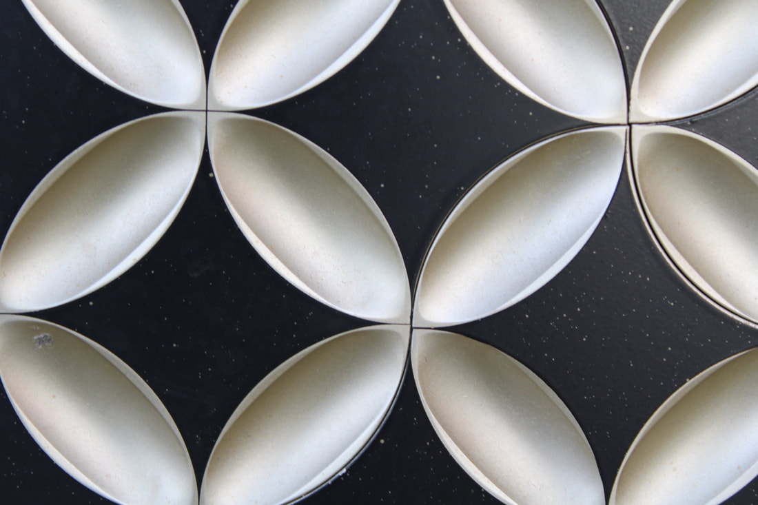
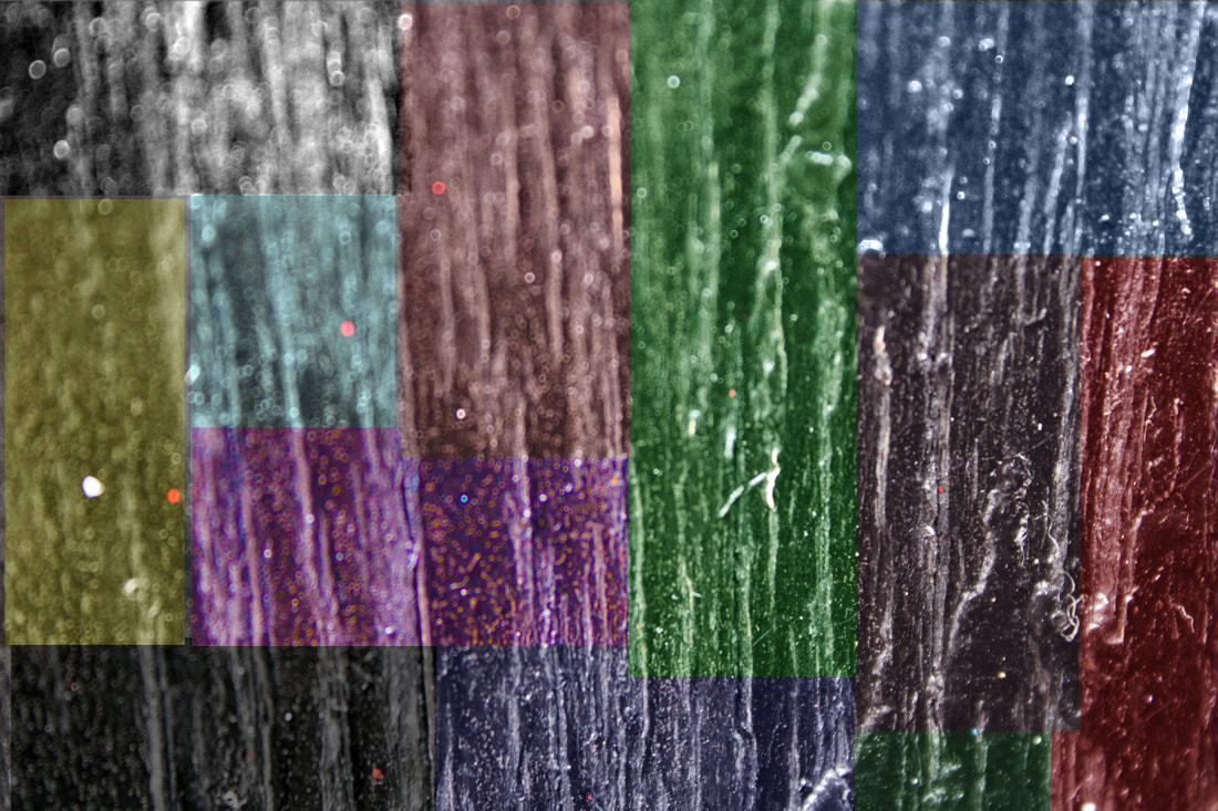
This was the last experiment I did. I went for a completely new style and idea. Before, I was experimenting with time lapse. However, unfortunately it was way too easy for me. So I took it upon myself to try something more challenging. Furthermore, my new experiment was the split mini panel canvas design and I honestly enjoyed doing this so much. In my opinion it was different from my other experiments. So, I personally think it stood out to me the most, since its divergent and unique.
My sixth experiment


BEFORE |
AFTER |
|

|
This was my most recent experiment. I attempted another split mini panel canvas design. I am really proud of how the outcome came and I believe that I can use this design in the future and I can make it more complicated like adding colours.
My seventh experiment


BEFORE
|
AFTER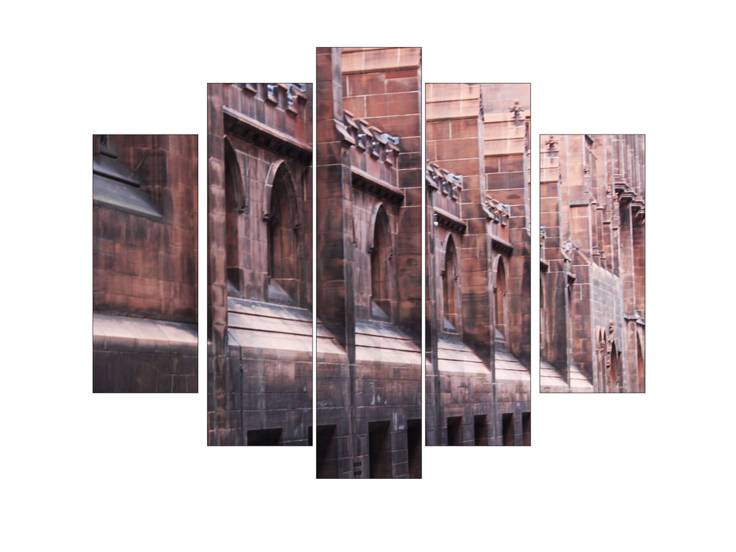
|
My eighth experiment


BEFORE
|
AFTER
|
WHY MANCHESTER IS SIGNIFICANT TO ME!
I grew up in Manchester, It has always been my home. When we went to Manchester city Centre, I felt relieved. This is because, I'm used to going there, seeing beautiful things. So, when we decided to go there for our photography trip. It was meaningful to me, as It gave me the chance to create more memories and to create beautiful final outcomes. Using, the pictures I have taken myself.
PERSONAL OUTCOMES JOURNEY?
In my opinion, my outcomes so far all link up in a unique way. I have been exploring 'mini panel canvas design'. For me, personally this experiment is really fun and interesting to make and its intriguing to see the final result. For now, I have carefully picked out the images that are impactful to my photoshop theme. These images have been handpicked from the photography shoot in Manchester City Centre. The recent photoshop experiments I have been doing are linking up to the 4 elements. I have done earth, and right now I'm in the middle of finishing my glass. I personally think, this will impact my work In so many different ways. For example, there is now an intriguing mysterious meaning behind my work. In my opinion, this makes my work so much more meaningful. My personal outcomes aren't just here to look nice and pretty. There is a bigger and more in depth meaning to it. Once, I finish my final gallery, there wont just be beautiful images, but an impressive story. There are concealed links, that will all make sense at the end of this project.
FINAL GALLERY


EVALUATION
My main theme was to explore different textures. I carefully showcased natural and man made texture by showcasing the natural textures of fruits and vegetables e.g. While doing so, I also took the time to explore more man made elements such as glass and black etc. In my opinion, This 'Texture' theme was perfect as it allowed me to go in depth with with my images. It also allowed me to visit other locations and take burst shots. I personally believe that once the Photoshop stage arrived in my project, I was able to expand my creativity within my work and also got the opportunity to link my pieces with one another creating better texture.
In my opinion, I found that taking photos was definitely the most enjoyable part throughout this whole journey. I also think that learning Photoshop and editing was truly amazing and encouraged me to do better in my work. I personally believe that brutally editing your pictures in Photoshop isn't what Photography is about. I think, learning these skills improves me as an artist and a photographer. Going out on a location and investigating places I havent seen before is intriguing and enjoyable because there is so much beautiful things out there, that you wont find in a rippled city like Manchester.
Crafting my Weebly website to uphold a professional standard in showcasing my work is a skill I never anticipated needing until I delved into photography. I have ensured that my photos are consistent, arranged and categorized correctly. This has significally enhanced my organizational abilities. I've had the opportunity to expand my photo editing skills, including learning more photoshop techniques such as layering images, flipping them horizontally and vertically and finally striving for symmetry in my composition. I have acquired these skills/techniques through tutorials offered by the school, and they were honestly quick and easy to master. My overall understanding of a manual camera have significally advanced, as I now grasp concepts like ISO and WB and can use this to manipulate and enhance the depths of my work. Mastering these skills will undoubtely assist me in overcoming challenges in my future projects.
Although, I have encountered some challenges in improving my Photoshop skills, I'm determined to develop them further. While I currently aim to improve the sophistication of my work, I view this as a long term goal, envisioning future projects where I can create more refined galleries.
I've endeavoured to integrate the four elemental aspects of the earth,including brick and sky,into my Photography. Inspired by the unique and old fashioned style of photographer Iwao Yamawaki, whose primary focus is architecture, I find his refined approach truly captivating. Despite the enclosed colour palette in his work, which he deliberately keeps minimal, I'm fascinated by the abstract quality he acheives. In my exploration, I've sought to directly connect my work to his by employing techniques in Photoshop, resulting in abstract and enhanced final outcomes.
In my opinion, the photography technique that I found most enjoyable was adjusting the camera lighting and settings. This honestly added substantial impact to my images, making them more captivating. It was particularly entertaining for me because it bolstered my confidence in my work. Initially, using a genuine Canon camera was unfamiliar territory for me in photography. Yet, with time, I've gained considerable knowledge and proficiency, thanks to these cameras. Using them now, I feel a heightened sense of professionalism, as they lend a realistic quality to everything I photograph.
In my opinion, I believe the most successful and integral aspect of this project was the photo shoots featuring natural textures like flowers,trees and rocks, as well as man-made textures such as glass,chains and lamps. Among all the shoots completed for this project, I consider these two to be the most professional. Particularly, the images of the sky,bricks and architecture have allowed me to create more polished final outcomes in Photoshop by layering them atop one another. This demonstrates the increased efficiency and confidence I've gained in my work.
Initially, I encountered many challenges in ensuring that the camera settings were accurate and produced the most natural results. Additionally, there were numerous instances where I took multiple photos, but many of them turned out either unfocused,overexposed,underexposed or too dark. As a result of this, delving into Photoshop at the outset was also daunting, as I lacked familiarity with the tools and had no idea where to begin. However, with each minute spent in Photoshop and checking the cameras precisely, these difficulties of mine gradually became more manageable. Reflecting on these challenges, I grew prouder of my work as the project progressed. Witnessing my improvement over time.
Throughout my journey, I've had the occasion to learn a plethora of new things, both technologically and environmentally. Researching photographers and their techniques marked the beginning of my own photographic adventure, shaping how I approached my work. Previously, my photography was limited to phone cameras, so transitioning to a manual camera was a significant step towards enhancing and refining my skills. Exploring locations like Manchester City Centre with this camera was a priviledge, allowing me to immerse myself in nature and learn how to capture images that captivate viewers. Initially, I was hesitant to learn Photoshop due to a lack of confidence in improving my images. However, taking that leap of faith and refining my images along the way has expanded my creativity and given me the confidence to enhance my work further.
If I were to embark on this project again, I would likely approach it with more independence. For instance, I would utilise my free time to capture a diverse array of images and explore different locations for unique perspectives. Additionally, dedicating time to refining my work independently would be essential, as there's often insufficient time to complete everything during scheduled sessions. Overall, the adjustments I would make revolve around taking greater initiative and refusing my photography with a more personal touch. Nonetheless, I'm immensely proud of the journey I've undertaken thus far, and I eagerly anticipate further advancement in my skills.
